
I’ve done some crawling and data visualization, with the help of Codex.
Chart 1: Monthly International Flights and Passengers
The following chart shows:
- Total count of international flights per month (incoming + outgoing) – on the primary axis
- Counts of incoming and outgoing international passengers – on the secondary axis
- Disruption overlays for closure/restriction periods
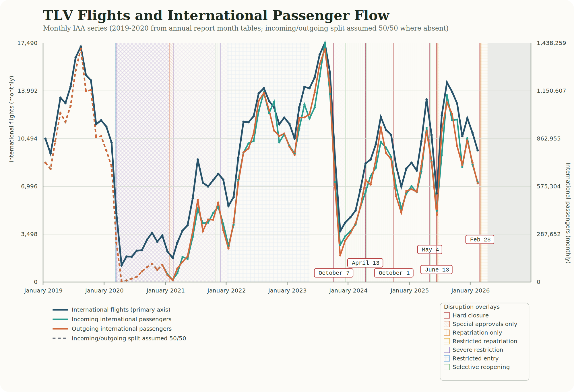
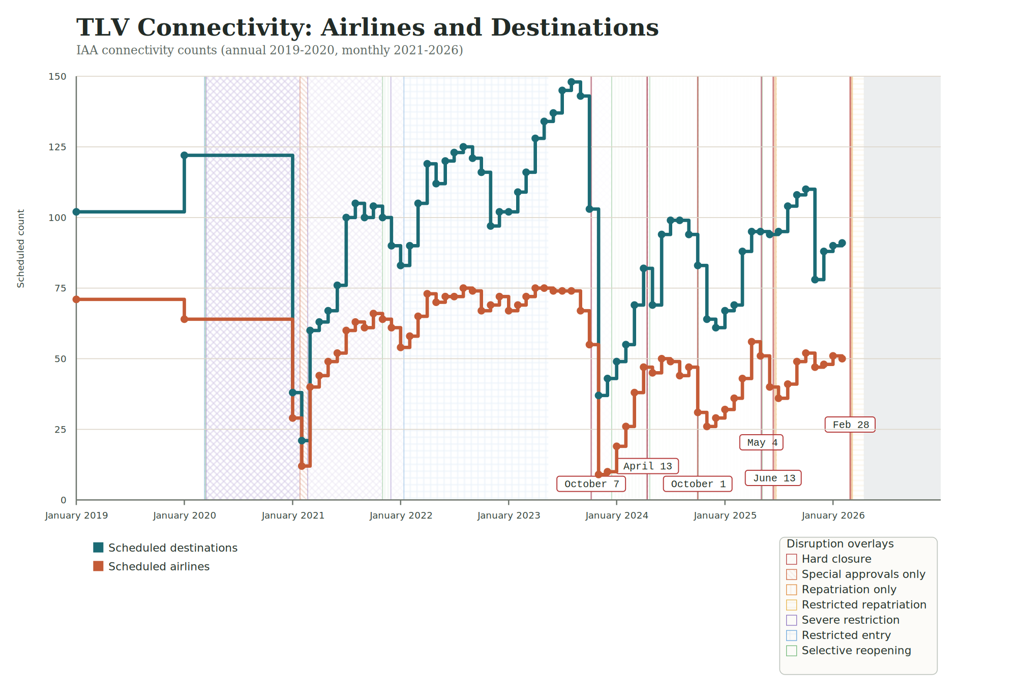
Chart 2: Scheduled Airlines and Destinations
How many airlines operated to and from TLV / LLBG (Ben Gurion Airport)? How many destinations are served by scheduled flights?
The following chart shows:
- Airlines which had scheduled flights (annual counts in 2019 and 2020, then monthly)
- Scheduled destinations (annual counts for 2019 and 2020, then monthly)
- Airspace restrictions and travel restrictions overlaid
Quick caveat: The IAA reports include OTHERS rows in both airlines and destinations tables, so the actual number of airlines and destinations may be higher than shown in the chart. At the same time, the international aircraft movement counts can include cargo aircraft, so passenger-only connectivity may be lower than shown.
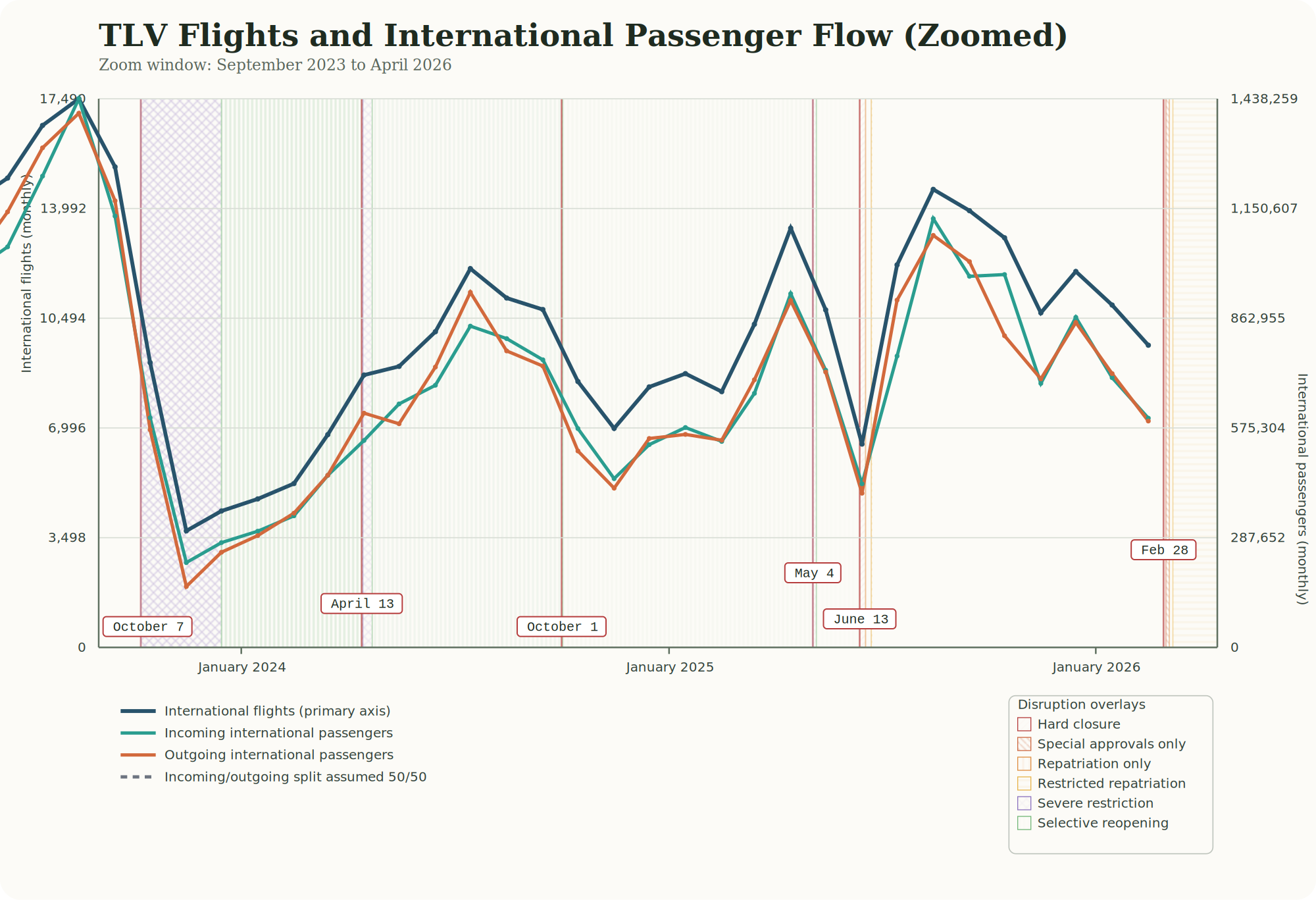
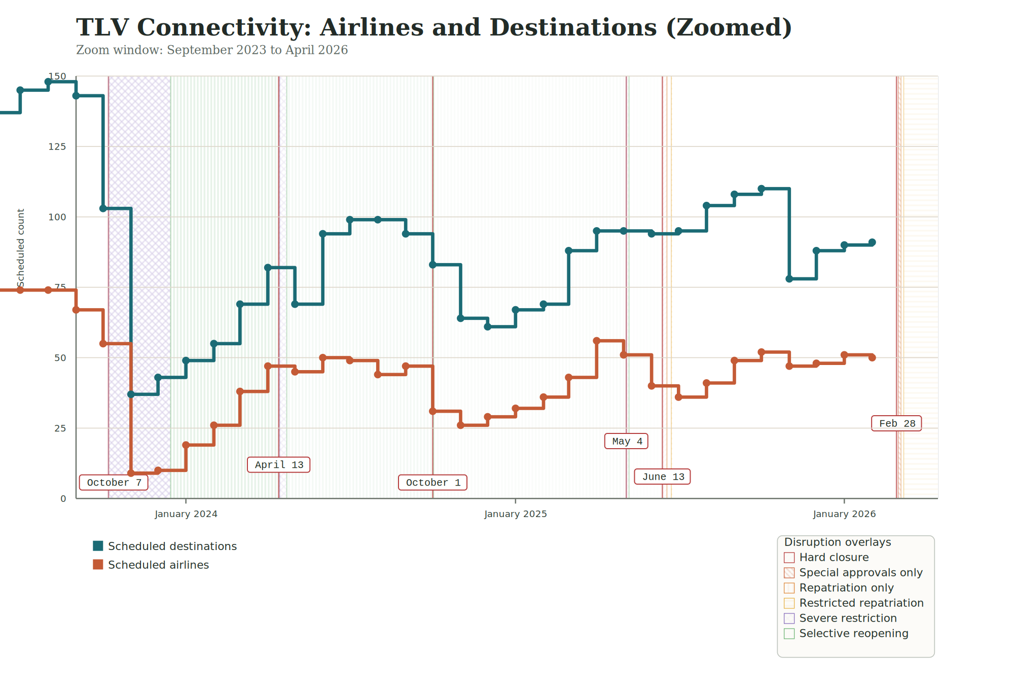
Zoomed View (September 2023 to April 2026)
Sources
- IAA annual and monthly reports (index page: https://www.iaa.gov.il/en/about/aeronautical-information/annualreport/)
- Data extraction and aggregation scripts available upon request.
Data
- Full data (and map of annual and monthly IAA reports): tlv_iaa_dataset.xlsx

Leave a comment